

Dyonery Twin XL Adjustable Bed Base Frame with Wireless Remote + 12 Inch Twin XL Gel Memory Foam Mattress Bed in a Box, Head and Foot Incline, Zero Gravity, Fiberglass Free, 80" × 38"
Twin XL
$539.99
Skip to product information

/* * Used when device = desktop * Configured in: configuration/brazil-config/global/brand-story.cfg */ /* Because the carousel is implemented as an ol list, any lists in the card text will have a secondary list style (letters). This will give an incorrect appearance to viewers, so we set all lists to the primary list style (numbers). */ .aplus-brand-story-card ol li { list-style: decimal; } /* Top level containers */ .aplus-module .apm-brand-story-hero { -moz-box-sizing: border-box; -webkit-box-sizing: border-box; box-sizing: border-box; width: 1464px; height: 625px; background-color: #fff; } .aplus-module .apm-brand-story-card { -moz-box-sizing: border-box; -webkit-box-sizing: border-box; box-sizing: border-box; width: 362px; height: 453px; background-color: var(--aok-sfs-color-page-primary-normal-bg, #fff); } .apm-brand-story-hero, .apm-brand-story-card { -moz-box-sizing: border-box; -webkit-box-sizing: border-box; box-sizing: border-box; position: relative; width: 100%; height: 100%; float: none; } .aplus-module.brand-story-card-1-four-asin .apm-brand-story-card { /* Only 12px to account for image cell border */ padding: 12px; } /* Full background image (Hero 1 & Card 2) */ .aplus-module .apm-brand-story-background-image { -moz-box-sizing: border-box; -webkit-box-sizing: border-box; box-sizing: border-box; overflow: hidden; position: absolute; width: 100%; height: 100%; } .aplus-module .apm-brand-story-background-image img { display: block; width: 100%; height: 100%; object-fit: cover; } /* Card 1 small images */ .aplus-module .apm-brand-story-image-grid { -moz-box-sizing: border-box; -webkit-box-sizing: border-box; box-sizing: border-box; padding: 0px; margin: auto; display: flex; flex-flow: row wrap; } .aplus-module .apm-brand-story-image-grid .apm-brand-story-image-grid-item { /* Use content-box to ensure image size matches editor schema */ -moz-box-sizing: content-box; -webkit-box-sizing: content-box; box-sizing: content-box; padding: 0px; margin: 2px; width: 162px; height: 185px; border: 1px solid var(--aok-sfs-color-page-inverse-normal-border, #fff); } .aplus-module .apm-brand-story-image-grid .apm-brand-story-image-grid-item .apm-brand-story-image-link { display: block; width: 100%; height: 100%; padding: 2px; } .aplus-module .apm-brand-story-image-grid .apm-brand-story-image-grid-item .apm-brand-story-image-link .apm-brand-story-image-img { display: block; width: 100%; height: 100%; object-fit: cover; } /* Card 3 logo image */ .aplus-module .apm-brand-story-logo-image { -moz-box-sizing: content-box; -webkit-box-sizing: content-box; box-sizing: content-box; height: 145px; margin: 0px 4px; padding: 20px; padding-bottom: 0px; } /* Text overlays */ .aplus-module .apm-brand-story-text-bottom { -moz-box-sizing: border-box; -webkit-box-sizing: border-box; box-sizing: border-box; position: absolute; bottom: 13px; left: 13px; } .aplus-module .apm-brand-story-hero .apm-brand-story-text-bottom { background-color: rgba(0,0,0,0.6); color: #fff; padding: 13px 65px 13px 13px; /* accounts for overlap of first card */ width: 437px; } .aplus-module.brand-story-card-2-media-asset .apm-brand-story-text-bottom { background-color: rgba(255,255,255,0.6); color: #000; padding: 13px; width: 336px; } .aplus-module.brand-story-card-1-four-asin .apm-brand-story-text { margin-top: 8px; padding-left: 2px; padding-right: 2px; } .aplus-module.brand-story-card-1-four-asin .apm-brand-story-text.apm-brand-story-text-single { margin-top: 20px; } .aplus-module.brand-story-card-1-four-asin .apm-brand-story-text h3 { white-space: nowrap; overflow: hidden; text-overflow: ellipsis; } .aplus-module .apm-brand-story-slogan-text { -moz-box-sizing: content-box; -webkit-box-sizing: content-box; box-sizing: content-box; margin: 0px 4px; padding: 20px; } .aplus-module .apm-brand-story-faq { -moz-box-sizing: content-box; -webkit-box-sizing: content-box; box-sizing: content-box; padding-top: 10px; } .aplus-module .apm-brand-story-faq-block { margin: 0px 10px; padding: 10px; }


Dyonery Twin XL Adjustable Bed Base Frame with Wireless Remote + 12 Inch Twin XL Gel Memory Foam Mattress Bed in a Box, Head and Foot Incline, Zero Gravity, Fiberglass Free, 80" × 38"
$539.99
- 【Adjustable Bed Frame with Mattress】 You can adjust the bed to the best position(Head 0-57°,Foot 0-38°) .Upgrad Zero Clearance Mechanical Design allows the adjustable bed frames to be used without legs, compatible with any platform or flat surface, they’ll fit neatly inside existing headboards, footboards, and side rails.
- 【Improved Comfort】: The Dyonery adjustable bed base can help improve overall comfort. By being able to adjust the position of the bed, you can find the perfect angle for sleeping, reading, or watching TV. This can help to reduce pressure points, relieve pain, and improve sleep quality.They are also great for people with mobility issues who need to adjust the bed to a specific height.
- 【Gel-Infused Memory Foam Mattress】The Dyonery Gel-infused memory foam mattress offers you with a fresh and clean sleep environment, helps to regulate temperature and relief pain.keeping you cool and comfortable for the whole night.
- 【CertiPUR-US & Oeko-Tex Standard 100 Certified】Our mattresses are certified by both CertiPUR-US and Oeko-Tex Standard 100, ensuring that they are free from harmful substances. The memory foam and fabrics have been independently evaluated to comply with all mandatory and voluntary safety standards for mattress products.
- 【Worry-Free Warranty Sleep】We are dedicated to providing you with the best night's sleep possible through our superior products. If there are any issues with your mattress, please contact our customer support team and they will assist you in resolving the problem. Please note that our mattresses cannot be returned once opened.
/* * Used when device = desktop * Configured in: configuration/brazil-config/global/brand-story.cfg */ /* Because the carousel is implemented as an ol list, any lists in the card text will have a secondary list style (letters). This will give an incorrect appearance to viewers, so we set all lists to the primary list style (numbers). */ .aplus-brand-story-card ol li { list-style: decimal; } /* Top level containers */ .aplus-module .apm-brand-story-hero { -moz-box-sizing: border-box; -webkit-box-sizing: border-box; box-sizing: border-box; width: 1464px; height: 625px; background-color: #fff; } .aplus-module .apm-brand-story-card { -moz-box-sizing: border-box; -webkit-box-sizing: border-box; box-sizing: border-box; width: 362px; height: 453px; background-color: var(--aok-sfs-color-page-primary-normal-bg, #fff); } .apm-brand-story-hero, .apm-brand-story-card { -moz-box-sizing: border-box; -webkit-box-sizing: border-box; box-sizing: border-box; position: relative; width: 100%; height: 100%; float: none; } .aplus-module.brand-story-card-1-four-asin .apm-brand-story-card { /* Only 12px to account for image cell border */ padding: 12px; } /* Full background image (Hero 1 & Card 2) */ .aplus-module .apm-brand-story-background-image { -moz-box-sizing: border-box; -webkit-box-sizing: border-box; box-sizing: border-box; overflow: hidden; position: absolute; width: 100%; height: 100%; } .aplus-module .apm-brand-story-background-image img { display: block; width: 100%; height: 100%; object-fit: cover; } /* Card 1 small images */ .aplus-module .apm-brand-story-image-grid { -moz-box-sizing: border-box; -webkit-box-sizing: border-box; box-sizing: border-box; padding: 0px; margin: auto; display: flex; flex-flow: row wrap; } .aplus-module .apm-brand-story-image-grid .apm-brand-story-image-grid-item { /* Use content-box to ensure image size matches editor schema */ -moz-box-sizing: content-box; -webkit-box-sizing: content-box; box-sizing: content-box; padding: 0px; margin: 2px; width: 162px; height: 185px; border: 1px solid var(--aok-sfs-color-page-inverse-normal-border, #fff); } .aplus-module .apm-brand-story-image-grid .apm-brand-story-image-grid-item .apm-brand-story-image-link { display: block; width: 100%; height: 100%; padding: 2px; } .aplus-module .apm-brand-story-image-grid .apm-brand-story-image-grid-item .apm-brand-story-image-link .apm-brand-story-image-img { display: block; width: 100%; height: 100%; object-fit: cover; } /* Card 3 logo image */ .aplus-module .apm-brand-story-logo-image { -moz-box-sizing: content-box; -webkit-box-sizing: content-box; box-sizing: content-box; height: 145px; margin: 0px 4px; padding: 20px; padding-bottom: 0px; } /* Text overlays */ .aplus-module .apm-brand-story-text-bottom { -moz-box-sizing: border-box; -webkit-box-sizing: border-box; box-sizing: border-box; position: absolute; bottom: 13px; left: 13px; } .aplus-module .apm-brand-story-hero .apm-brand-story-text-bottom { background-color: rgba(0,0,0,0.6); color: #fff; padding: 13px 65px 13px 13px; /* accounts for overlap of first card */ width: 437px; } .aplus-module.brand-story-card-2-media-asset .apm-brand-story-text-bottom { background-color: rgba(255,255,255,0.6); color: #000; padding: 13px; width: 336px; } .aplus-module.brand-story-card-1-four-asin .apm-brand-story-text { margin-top: 8px; padding-left: 2px; padding-right: 2px; } .aplus-module.brand-story-card-1-four-asin .apm-brand-story-text.apm-brand-story-text-single { margin-top: 20px; } .aplus-module.brand-story-card-1-four-asin .apm-brand-story-text h3 { white-space: nowrap; overflow: hidden; text-overflow: ellipsis; } .aplus-module .apm-brand-story-slogan-text { -moz-box-sizing: content-box; -webkit-box-sizing: content-box; box-sizing: content-box; margin: 0px 4px; padding: 20px; } .aplus-module .apm-brand-story-faq { -moz-box-sizing: content-box; -webkit-box-sizing: content-box; box-sizing: content-box; padding-top: 10px; } .aplus-module .apm-brand-story-faq-block { margin: 0px 10px; padding: 10px; }
.aplus-v2 .apm-brand-story-carousel-container {
position: relative;
}
.aplus-v2 .apm-brand-story-carousel-hero-container,
.aplus-v2 .apm-brand-story-carousel-hero-container > div {
position: absolute;
width: 100%;
}
/*
Ensuring the carousel takes only the space it needs.
The sizes need to be set again on the absolutely positioned elements so they can take up space.
*/
.aplus-v2 .apm-brand-story-carousel-container,
.aplus-v2 .apm-brand-story-carousel-hero-container {
height: 625px;
width: 100%;
max-width: 1464px;
margin-left: auto;
margin-right: auto;
overflow: hidden;
}
.aplus-v2 .apm-brand-story-carousel-hero-container,
.aplus-v2 .apm-brand-story-carousel-hero-container > div {
height: 625px;
}
.aplus-v2 .apm-brand-story-carousel.a-carousel-container {
padding: 0px;
}
/*
This centers the carousel vertically on top of the hero image container and after the logo area (125px).
Margin-top = (heroHeight - cardHeight - logoAreaHeight) / 2 + logoAreaHeight
*/
.aplus-v2 .apm-brand-story-carousel .a-carousel-row-inner {
margin-top: 149px;
}
/*
Cards need to have a width set, otherwise they default to 50px or so.
All cards must have the same width. The carousel will resize itself so all cards take the width of the largest card.
The left margin is for leaving a space between each card.
*/
.aplus-v2 .apm-brand-story-carousel .a-carousel-card {
width: 362px;
margin-left: 30px !important;
}
/* styling the navigation buttons so they are taller, flush with the sides, and have a clean white background */
.aplus-v2 .apm-brand-story-carousel .a-carousel-col.a-carousel-left,
.aplus-v2 .apm-brand-story-carousel .a-carousel-col.a-carousel-right {
padding: 0px;
}
.aplus-v2 .apm-brand-story-carousel .a-carousel-col.a-carousel-left .a-button-image,
.aplus-v2 .apm-brand-story-carousel .a-carousel-col.a-carousel-right .a-button-image {
border: none;
margin: 0px;
}
.aplus-v2 .apm-brand-story-carousel .a-carousel-col.a-carousel-left .a-button-image .a-button-inner,
.aplus-v2 .apm-brand-story-carousel .a-carousel-col.a-carousel-right .a-button-image .a-button-inner {
background: #fff;
padding: 20px 6px;
}
.aplus-v2 .apm-brand-story-carousel .a-carousel-col.a-carousel-left .a-button-image .a-button-inner {
border-radius: 0px 4px 4px 0px;
}
.aplus-v2 .apm-brand-story-carousel .a-carousel-col.a-carousel-right .a-button-image .a-button-inner {
border-radius: 4px 0px 0px 4px;
}


-
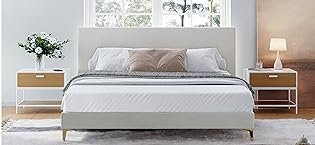
We are an innovative American mattress brand. All Dyonery products are designed to make you feel comfortable and have a good night's rest.
The goal of the Dyonery brand is to seek better comfort and to be a trusted name to customers.
Share Moments. Share Comfort.
-
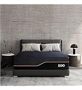
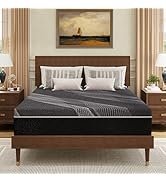
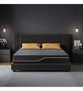
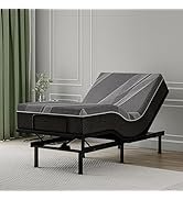
All For Your Room
-
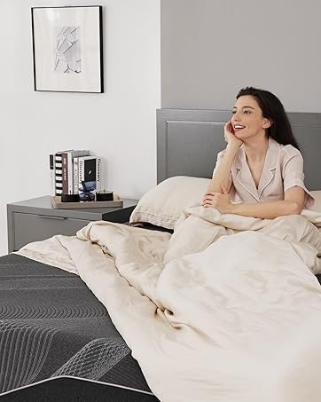
Our cooling gel-infused charcoal memory foam mattress offers you with a fresh and clean sleep environment.
-
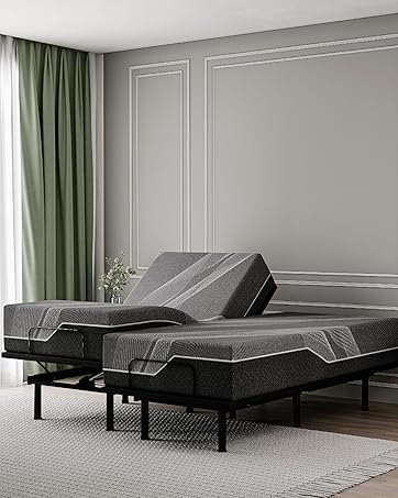
The Dyonery adjustable bed base can help improve overall comfort. You can find the perfect angle for sleeping, reading, or watching TV.